GLS Technology: Our client provides and installs audio visual and smart home solutions. He came to us in 2014 having launched his business a year before and asked us to create a business identity that conveyed professionalism and educated the public what his company did. He liked the idea of using lime green in his brand to symbolize growth, energy efficiency and sustainable solutions. In addition to green, black and grey were the other colours used in the brand. For typography we used Handle Gothic for “GLS Technology”. This sans serif font with an attractive geometric shape and futuristic style was a good fit for the type of business and client preference. For Electronic System Integrators another modern easy to read typeface, Futura Condensed was used.
The grid like pattern in the logo design was inspired by a key aspect of the client services, providing wiring and electrical schematics drawings to their clients. It represents the multiple connections in a home amongst multiple services and devises.
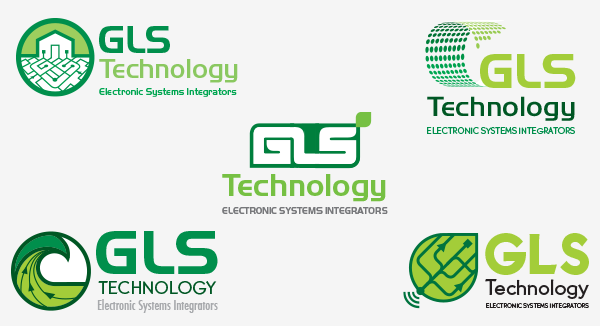
Below are the mock-ups of the logo choices we presented to our client:
After the the client’s logo selection , we worked on refinements to the design and offered different variations to choose from:
Once the final look of the logo was approved by the client, we perfected it, by ensuring that all its elements are balanced and clean. We used grids with different perspectives, and angles to optimize the design.
We experimented with different colours and different shades of green, working with our client preferences and offering our advice.
Our client was delighted with his new brand and about a year later as his business grew, he came to us do a vehicle wrap design to promote his brand. We designed and arranged the installation of the wrap, which you can see below.


