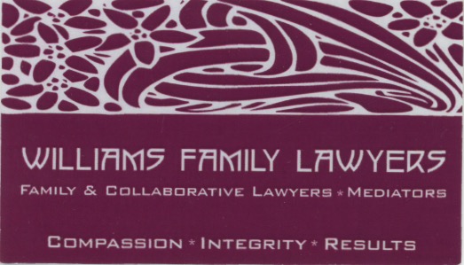
Our client Cheryl Williams took over a family law practice she was a partner in about a year earlier when her former business partner was appointed a judge. After Cheryl’s takeover of the firm she renamed the practice but without time for a complete re-branding she stayed with the overall design theme and maintained the floral logo icon that was used by her former business partner. She came to us with the desire to re-brand her firm with a unique logo, reflecting her personality and preferences and one that would appeal to her client demographics. She wanted a brand that was bold, strong clean and modern and reflected professionalism.
Client’s original logo
The Williams Family Lawyers’ identity is based on the representation of the initials W F L in a tridimensional composition in which light and dark colours make the difference between angles and axis. The principal idea was to include an arrow shape integrated into the design that symbolizes the effort and strength of progressing through difficult life situations. The principal colours in the logo are dark red and grey. The red in the logo reflected one of our client’s favorite colours. The principal fonts we chose (Briller Bold and Briller Regular) are in keeping with the modern and clean design our client was looking for. Cheryl has let us know that she and her firm members are delighted with the new brand. Our design was completed in time for the move to new office premises which already reflect her new brand on interior and exterior signage.


