Wildfire was founded in late 2017 as a social organization to serve LGBTQ+ people working in various professions within the legal community. The founders of this organization engaged us to design the logo. Our client wanted the logo to convey an organization that had energy or spark that would bring people together creating vibrancy and positive energy. That is why they choose the name Wildfire and the slogan ” Lighting Up LGBTQ+ Legal Culture. They expressed a strong desire for the logo to represent a flame and the use of the LGBTQ+ rainbow colours in the design. The resulting design is a minimalistic representation of a wildfire, depicted as a flickering flame momentarily suspended in the middle of the air. The colours are a direct reference to the LGBTQ+ flag.

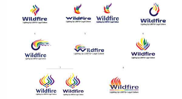
As part of our logo design process we offer different logo alternatives to choose from. Normally we develop different logo themes but in this case our client expressed a strong desire for the logo to represent a flame and as you can see below we offered these different representations. We also showed the logo type in alternative fonts and colours.

