Our clients are members of the Toronto Danforth Liberal Association who established an award to honour the memory of Suzanne McAllister, who was a long-time member of the Association’s Executive and a volunteer in many community groups. The award is to go to youth who support women in politics. We met with 3 members of the committee responsible for initiating the award and who were close to Suzanne and hope with the award to keep her memory alive.
We thought to include aspects of Suzann’s personality, style and preferences into the logo design. Our clients liked this idea as well.
Our clients described Suzanne as having a welcoming nature, modern, young, stylish and funky in way she dressed. That she loved wearing jewelry, and they recall her maroon coloured beaded necklace and that she wore multiple bracelets at the same time. She liked red and pink colours and liked to accessorize her clothing with black accents. She loved flowers especially Tulips.
Some of the things that came to our clients’ mind when we asked what they would like to convey with the logo were; female empowerment, Liberal politics and Suzanne’s welcoming nature. We asked how do you see a welcoming nature conveyed in a logo and one suggestion was open arms, while another was arms in an up position to reflect inspiration.
We took all this information to create these 7 different logo options. One based on her likeness, then a monogram with a Tulip, another with a raised arm , next a bouquet with 3 flowers that morph into 3 female figures with raised arms, then a container with a Tulip bulb and 3 flowers , another one based on a germinating bulb with the beginning of a stem that also looks like a flame and finally a four leaf clover with a vein in the leaf that resembles the letter “S” for Suzanne.

Our clients chose the tulip bulb with the 3 flowers for the logo.
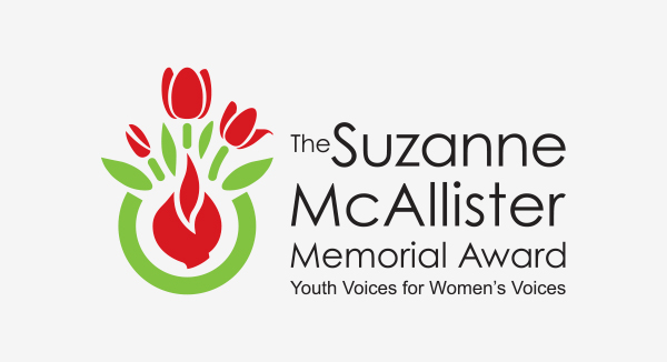
The principal logo colours are red, green and black. The Red is the same shade as the Liberal logo and was one of Suzanne’s favorite colours. The green colour represents nature and growth and black both balances against all the color used in the icon and at the same time represents the black accents Suzanne liked to accessorize her clothes with. The Tulip represents a favorite flower of Suzanne’s and the germinating bulb representing the idea of growth that the award is meant to stimulate and the 3 flowers showing different stages of development. The font is Century Gothic, a clean, simple San Serif font that our clients liked.